Orthopedic Specialists of Jacksonville
Logo Design - Freelance Work
Orthopedic Specialists of Jacksonville is a newly established dynamic orthopedic practice founded by a team of highly respected surgeons in our region.
This logo design reflects their mission while establishing their new practice. Creating a sense of trust and recognition for their patients.
Overview
Brand Guidelines
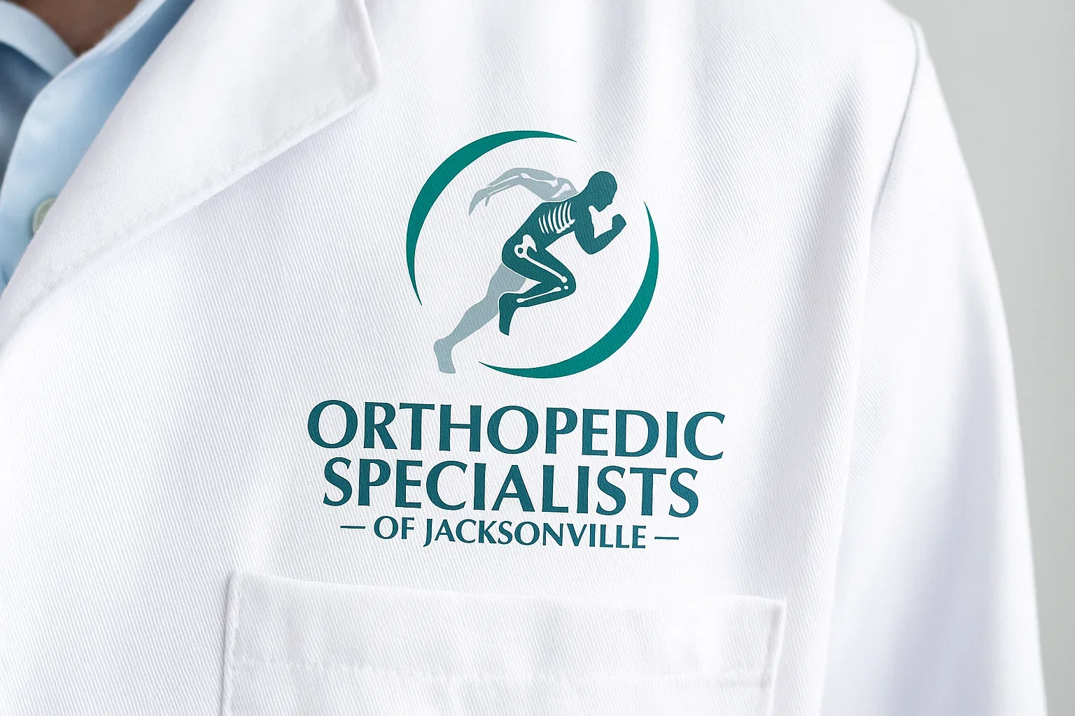
Topedic Specialists of Jacksonville symbolizes their areas of expertise and commitment to patient care. It positions them as a reliable and reputable brand through the purposeful selection of color and typography.
The icon within the logo depicts a person in a running posture, illustrating movement and biomechanics, thereby emphasizing the brand’s focus on active orthopedics and dynamism.
Logo Concept
Primary Lockup
Secondary Logos
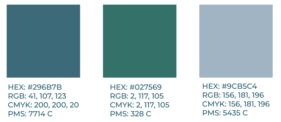
Color Palette
These colors were chosen for the sense of trustworthiness they create. With using color theory they not only compliment each other but bring a sense of ease to the viewer. They remain calming and yet grounded as they balance each other.
You can check out their website to see my logo in action below ↓
Typography
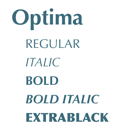
Optima, is the primary typeface. It combines the clean lines of a sans-serif with the formality often found in serif typefaces. It brings perosnality to the brand while remaining readable and formal.

Logo Clear Space
This is the minimum clear space around the logo, defined by the height of the "O" from the logo.